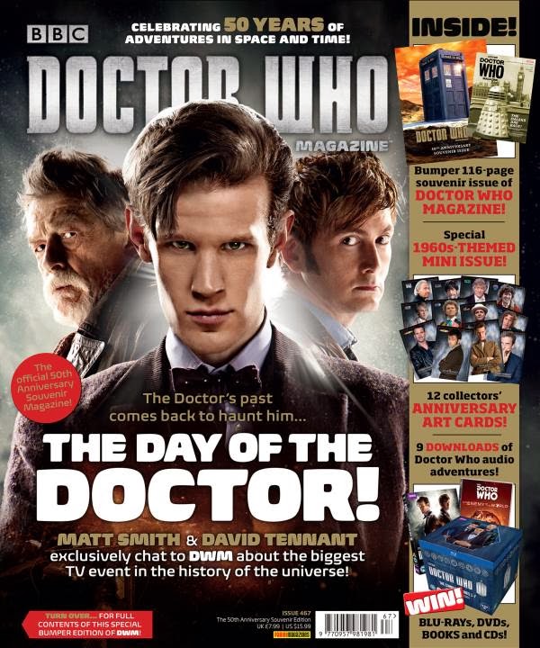
Title
of publication
- The title of
publication follows the general conventions of it being in the top third
of the magazine and using a distinctive typeface. This allows the magazine
to be noticed amongst other magazines on the shelf and so making it more
successful. The distinctive typeface allows the brand to be built and to
build recognition. This attracts customers that usually buy the magazine
to carry on and buy the magazine.
Slogan
- The slogan
in magazines intend to sum the content of magazine up in a short and
memorable sentence. In this case the slogan would be "The Day of The
Doctor!" This reinforces that the topic of this magazine is Doctor
Who. This slogan helps the consumers know what to expect reading this
magazine. It also attracts the fans of the series of Doctor Who.
Central
image
- The central
image establishes the magazines core values and identity. In this magazine
the central image is the Doctor. The mouth and eyes of the model is not
obscured by any text which is a common convention in the central image.
This keeps the characters seen expressive. In this magazine there are 3
images seen but the centre image is the Doctor. The costume worn by the
characters are casual suits. This is the typical attire of the doctor and so
it helps with the branding and the conventions of Doctor Who.
‘Flash’
/ Cover Line / Sell Line
- The key
convention of a cover line is used in this magazine. An example of a cover
line in this magazine is "The Doctor's past has come back to haunt
him". This attracts the consumers as this short sentence has an eerie
implication thus creating an interest amongst consumers. Another cover
line used is ..."the biggest TV event in the history of the
universe" This use of adjectives to highlight the magnitude of
their topic such as "biggest" and "universe" create an
importance and an expectation.
Free
offer
- There are a
series of offers seen in the front cover of this magazine. The free offers
are Doctor Who related merchandise. Offers such as "9 Downloads of
Doctor Who audio adventures" and "Special 1960-themed mini
issue" This gives Doctor Who fans another reason to buy this
magazine. So the free offers create a unique selling point to the Doctor
Who fan base.
Colour
scheme
- The colours
used in this front cover are colours that aren't to heavy to look at. The
colours are namely: black, silver and light brown. Limiting the front
cover to just a colour scheme it makes the magazine easy for the readers
to decode and it avoids it becoming too busy. The cloud of sliver coming
from the black gives an element of surprise and anticipation. As it seems
like there is something hidden in the mist. This intrigues readers as
it brings about an uncertainty.
Name
Checks
- The names
checks in this magazine are "Matt Smith" and "David
Tennant" The thing that these two people have is that they have had
the role of playing the Doctor in Doctor Who. This clearly indicates that
the topic inside of this magazine is Doctor Who. It is clear for the
audience to distinguish that this magazine will be concerning the British
series of Doctor Who. Also it acts as a unique selling point because
readers would want to read what they say as readers could gain
exclusive information about what to expect in the following series's.
Language
- One of the
texts standing out on this front cover is "The Day of The
Doctor". The language technique used is the repetition of
"the". This gives a sense of importance as it is "The
Day". This brings interest as readers would want to read about why
this day is so significant for the Doctor. Also, the alliteration of
"D" in "day" and "doctor". The 'd' sound is
harsh sound which could foreshadow that something bad could happen. Also
the alliteration is also used as it makes the phrase more poetic and
song-like which makes it more memorable.
Competitions
- The
competition is seen on the bottom right hand corner of the page. It reads,
"WIN! BLU-RAYs, DVDs, BOOKs and CDs" This makes the reader feel
more personally involved with the magazine which draws the readers in. As
the word 'win' is capitalised, it catches the readers eye and the word
'win' can appeal to people as this verb implicates prizes and
celebration.
Direct
Address & Asking Questions
Bar
code, Date and Price
- The bar code
is seen next to the competition section. This is mainly for selling the
magazine. The bar code is small which is common so that the integrity of
the magazine isn't compromised.
The
‘Real’ Target Audience
- The target
audience of this magazine is for those who are interested in Doctor Who.
This means that the age range of this magazine is very broad as the first
series was aired in 1963.
The original Doctor Who started in 1963 and ended in 1989. So the target
audience of this magazine is all the way up to people in their 50s.
No comments:
Post a Comment